Wagamama Retail
A creative and distinctive refresh of the Wagamama retail range, designed to captivate customers and give a stand-out pack experience.
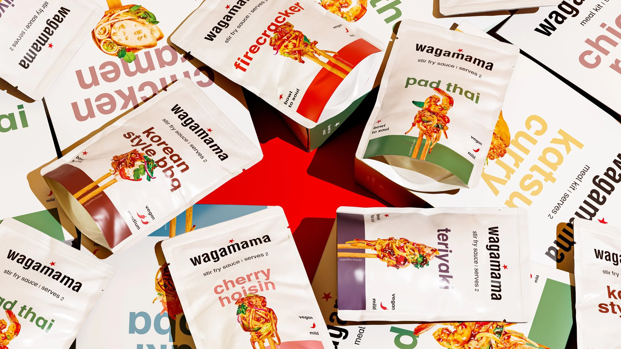


Bold type, beautiful colours and enticing visuals were at the core of delivering the refined and minimalistic retail pack refresh. Hierarchy, negative space and captivating bite-size visuals are supported by recognisable colours for each flavour profile.
In order to break through the noise of the competition there had to be something different, remembering that on average, the pack has three seconds to influence someone’s decision in the aisle.
AI software was implemented into the process to create variations of food photography in order to quickly and effectively design multiple concepts for Wagamama review. This allowed faster experiments in design, without having to set up real photography in a studio and allowed the Wagamama team to make key decisions about styling quickly and effectively.
Building on findings from the research and strategy work, a hierarchy was established that put product and flavour at the top of the list, ensuring that people could quickly and clearly find what they were looking for. The result is a bold and colourful type setting, subtly overlapped by the luxurious food photography that pulls you in, while all secondary information is there waiting for further inspection once in hand.